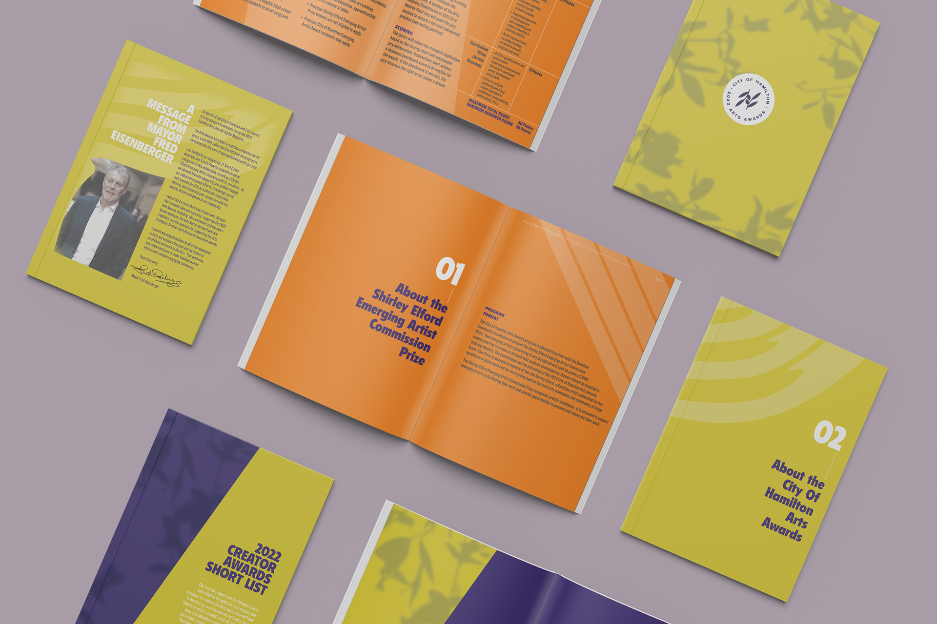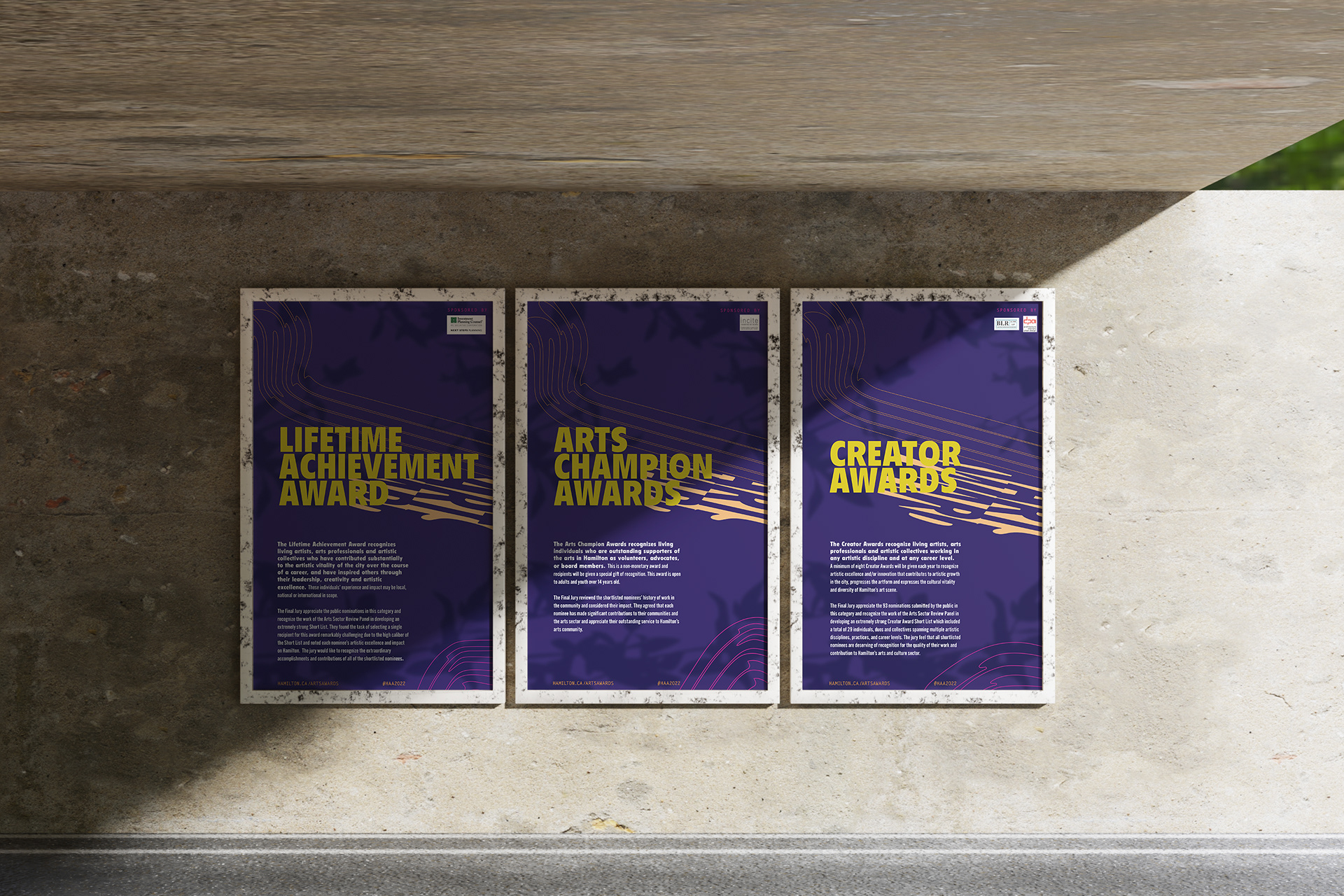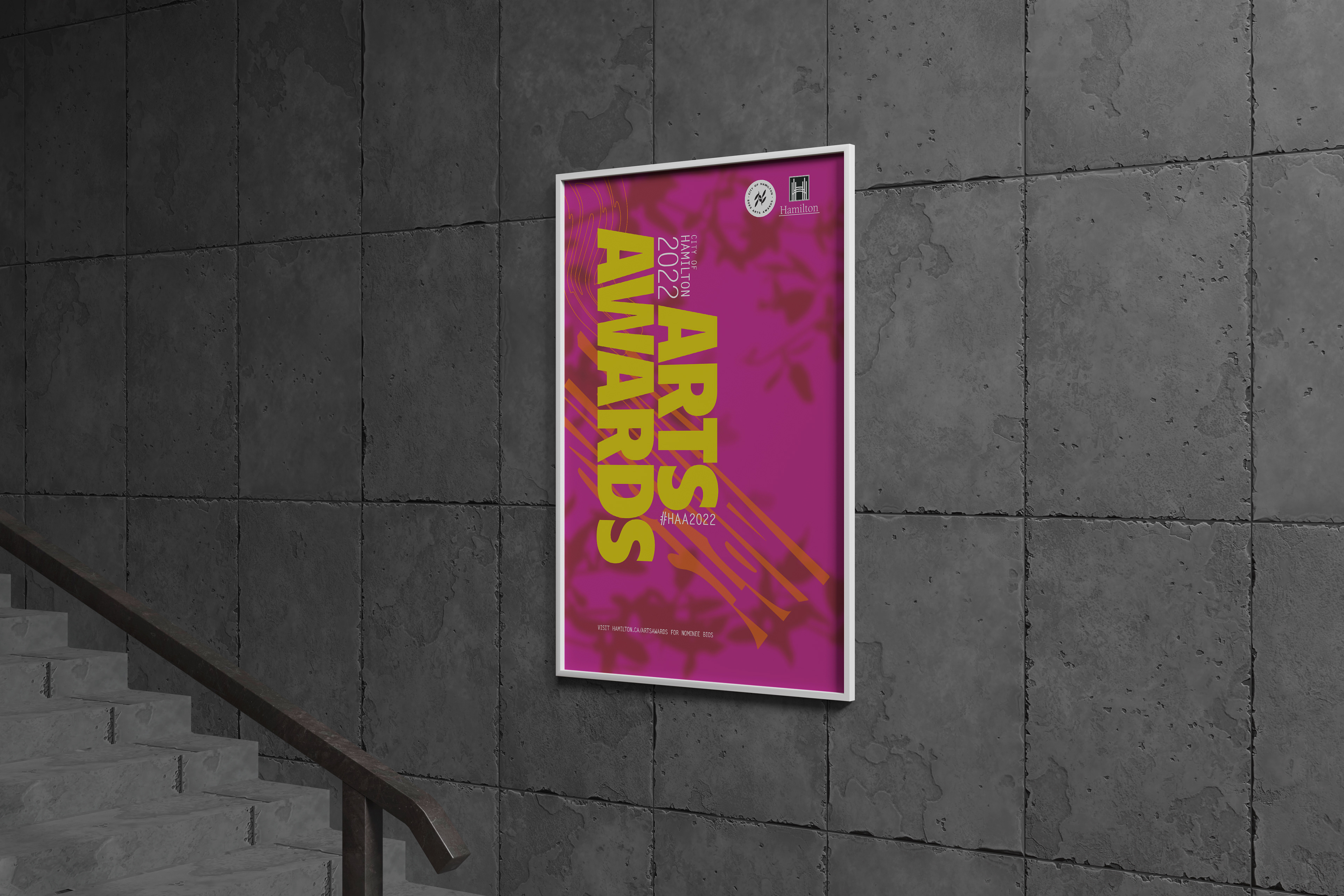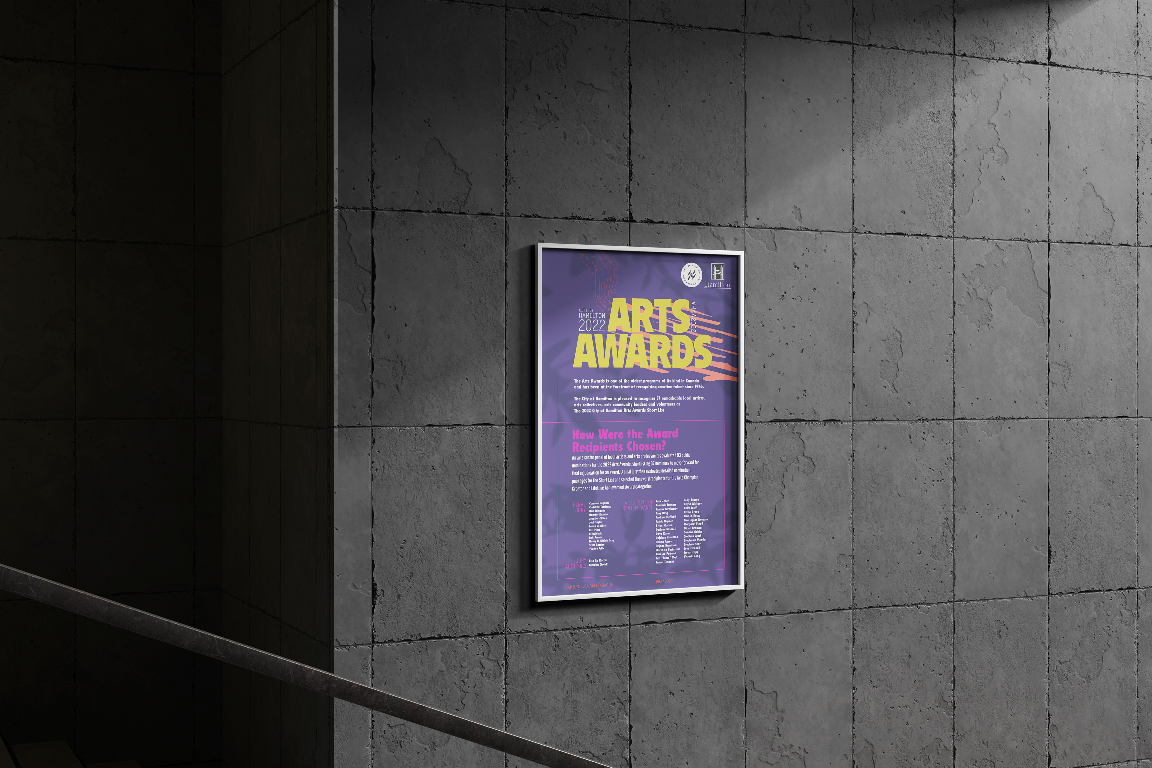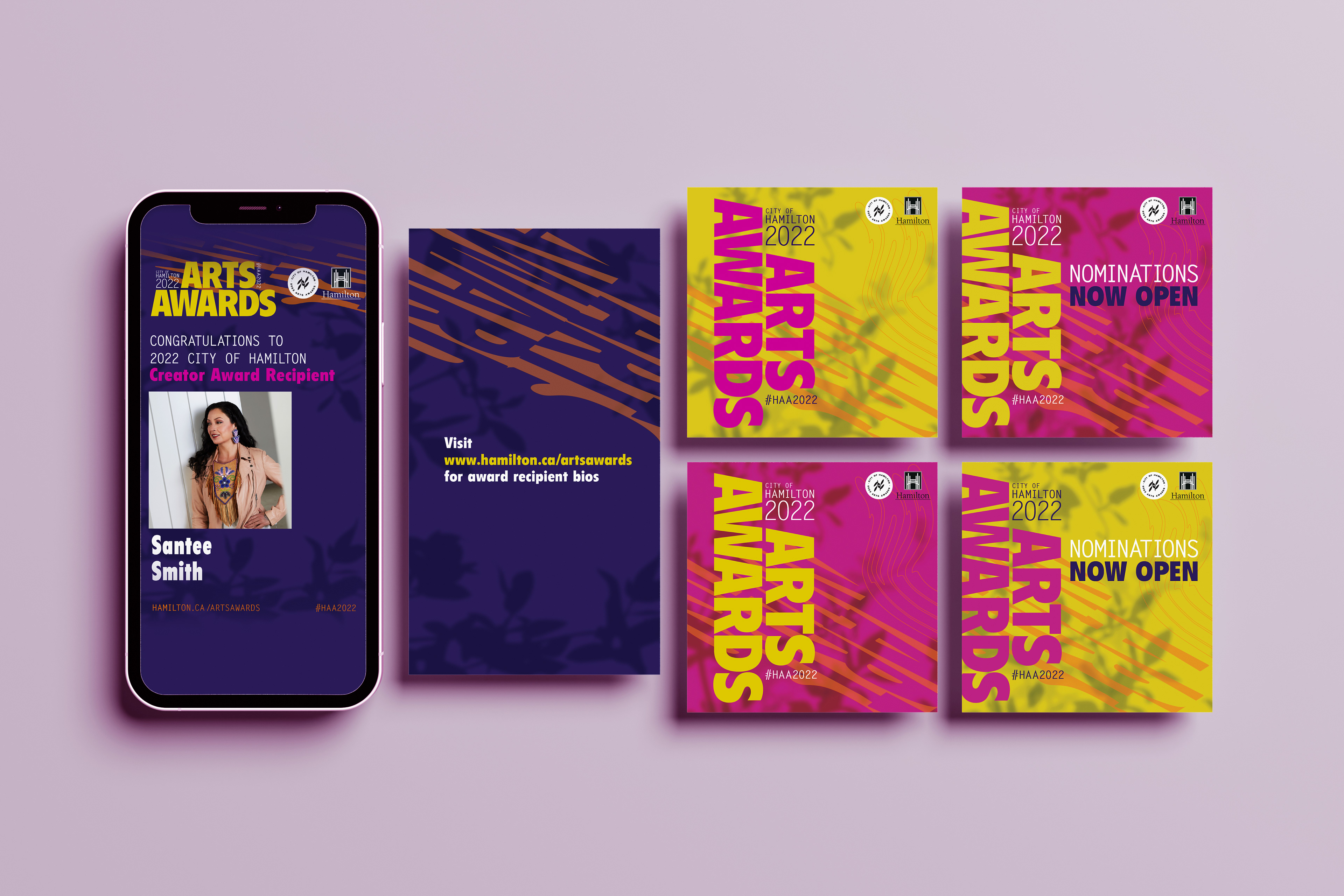
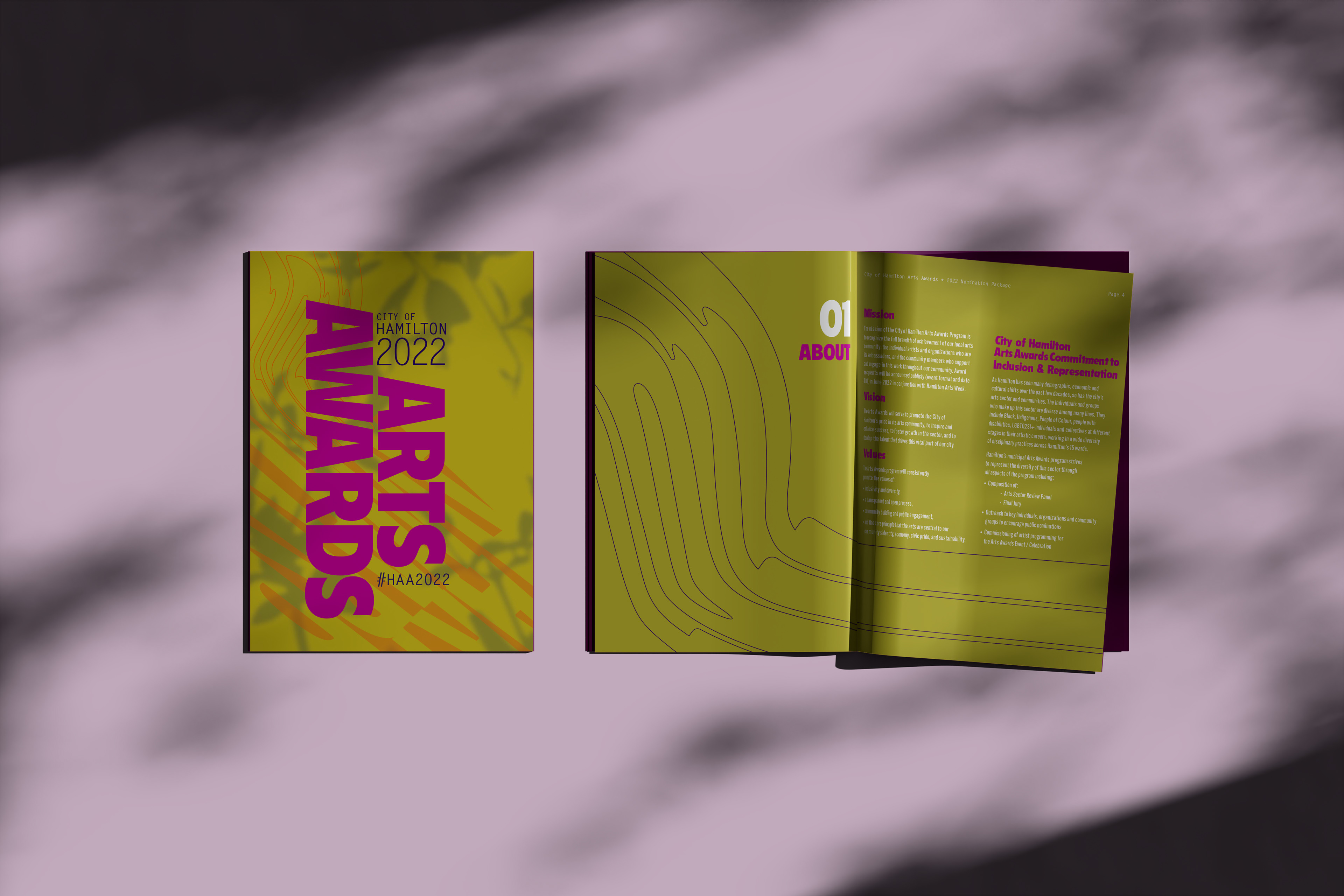
Art direction and graphic design for the 2022 Hamilton Arts Awards. The concept was inspired by the collective experience of time distortion during the pandemic, symbolized by long shadows and warped typography. The chosen palette and aesthetic pay homage to the 1960s, an era marked by significant social change and resilience.


CONCEPT STATEMENT: LIGHT EMERGING FROM THE SHADOWS
2021 had a lot of darkness come to light. Not only the shocking impact of the residential school discoveries,
but also the awakening of our collective consciousness to examine our past. It was a year of revelation.
but also the awakening of our collective consciousness to examine our past. It was a year of revelation.
It was also a year of resilience. Not many could foresee 2021 being so overshadowed by the pandemic, still.
Time felt too fast, too slow, or altogether warped in suspended reality.
Time felt too fast, too slow, or altogether warped in suspended reality.
Despite all of this, it was a year of resurgence.
Art Crawls and galleries crept back, our favourite Vintage stores re-opened, Black Owned markets popped up, and even SuperCrawl came roaring back with live music at Bayfront Park. Each with even more emphasis on togetherness, support and our wonderful community.
The palette and overall aesthetic is inspired by our incredible Vintage community, the time period of the 1960s.
Orange is incorporated for inclusion of our Indigenous brothers, sisters and siblings. Their art has been a source of healing for not only their own community but for many of us, too.
Light comes from beyond a shadow of a tree in the background, incorporating our branch motif and symbolism of growth, as we emerge from 2021 into 2022. A warped yet joyful 2022 symbolizes how strange time has felt during the pandemic. Illustrated to feel like mushroom shoots emerging from soil. Used as a visual device to lead the eye from the logo to the main block of typography.Will be used as accent typography in future instances.